 Vivid watercolor study of the last of my sunflower & dahlia.
  Putting a Design onto a product extends the gardening season.
 |
| Welcome Mat by Zazzle |
Vivid watercolor study of the last of my sunflower & dahlia. Putting a Design onto a product extends the gardening season. |
| Welcome Mat by Zazzle |
 Taking time out from tight renderings.
 Playing with swirls & doodles, pretty pastel over color paper toned with oil turpentine. Pretty enough to add to my Birthday Collection.
 If I can't get to the sea, then the sea must come to me...
 from small sketches on a dreary day to a New Birthday Design.

 There's never just the right color to copy nature, so one has to use whatever is at hand. Make whatever relations are necessary to make the color scheme work. I start with Phthalo Blue as underpainting. It's my current infatuation.
 I want to evoke the magic of the woods at dusk.
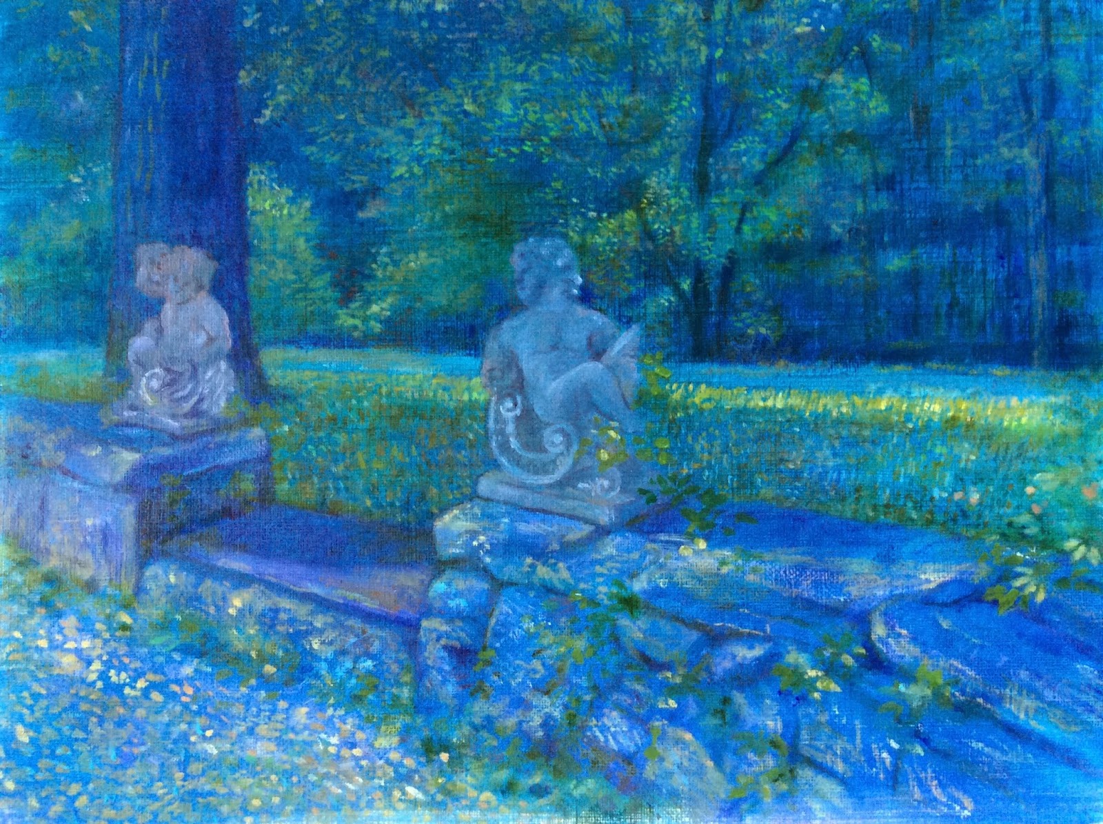 The artistry is not in matching a given color, but rather in matching its effect: its luminosity, its weight, its modification of the colors around it.
 A simple example of how I create a new design for license. This is my recent illustration of some farm fresh sunflowers.
 This summer cottage was painted years ago. I layered the sunflower stilllife onto this summer landscape. Nothing beats the joy of working with real paints, but photoshop can help me tell a better story...check out my New Sunflower Greetings.
 Delightful Cotswolds, straight out of a fairytale.
  Quintessentially English villages of honey colored stones, farm meadows & rolling hills.
  An area of outstanding natural beauty. Some good examples of how my work is shaped by the place.
 What a privilege to spend time in these storybook villages!
 In France on May Day, bouquet of Lily of the Valley is offer to loved ones, family & friends. No two project ever start the same way. From this pencil sketch, I wanted to finish this as a white & green painting.
 I was just playing around on photoshop to get a better composition...by clicking on different layers & filters, the drawing turns into this elegant white design.
 Hand drawn fonts are added onto another layer, to turn the design into specific greetings.


